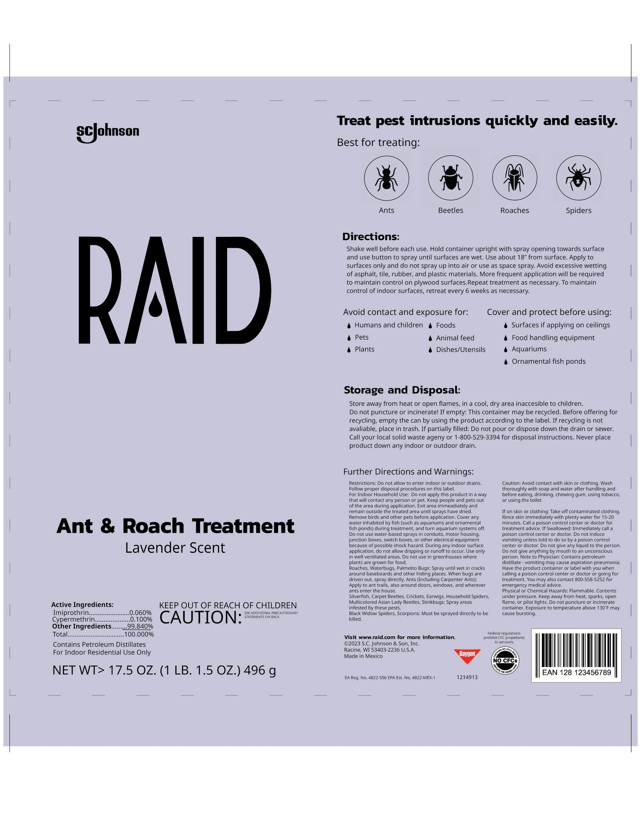
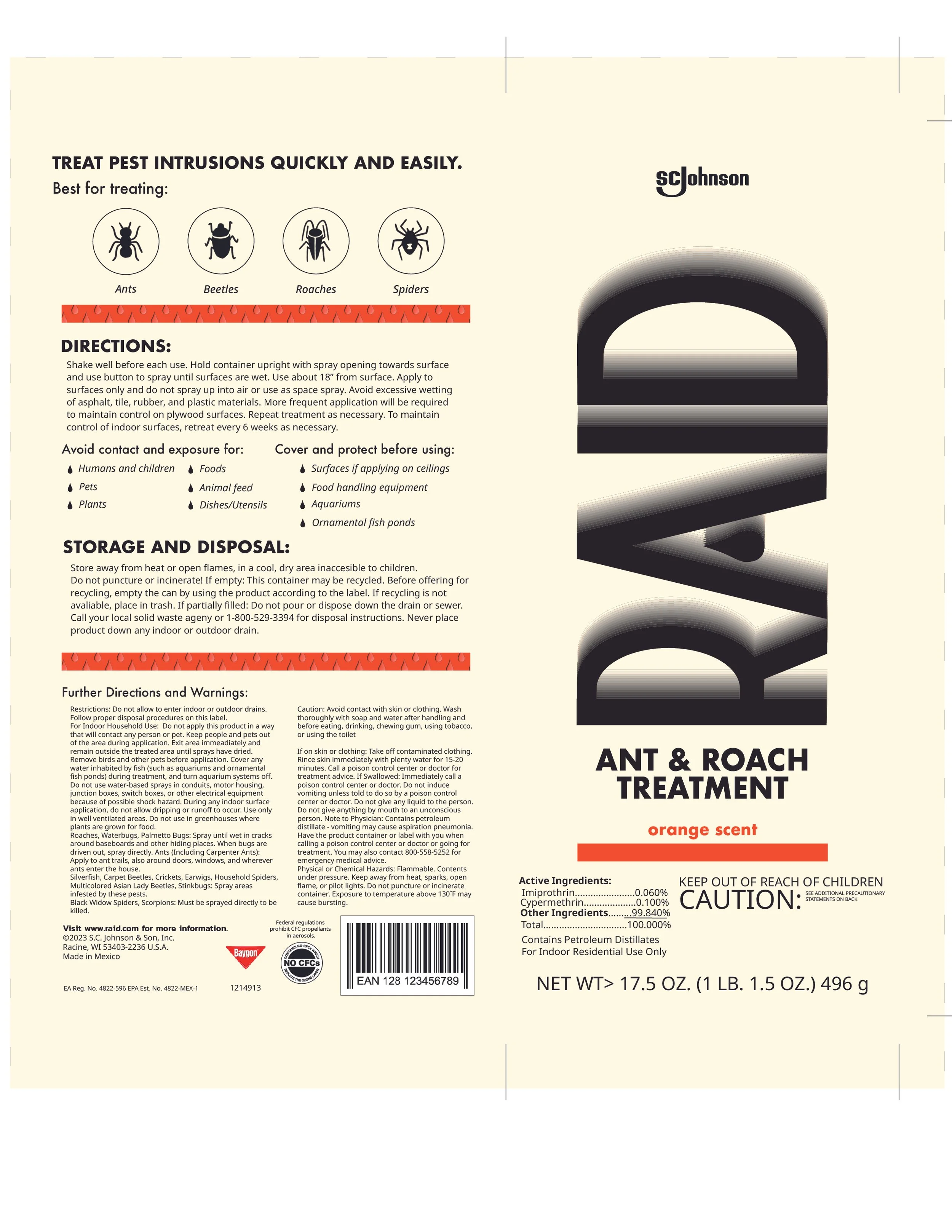
RAID
We all know RAID - Especially in North Carolina, I reach for it every time I see a massive creature with millions of legs in my kitchen.
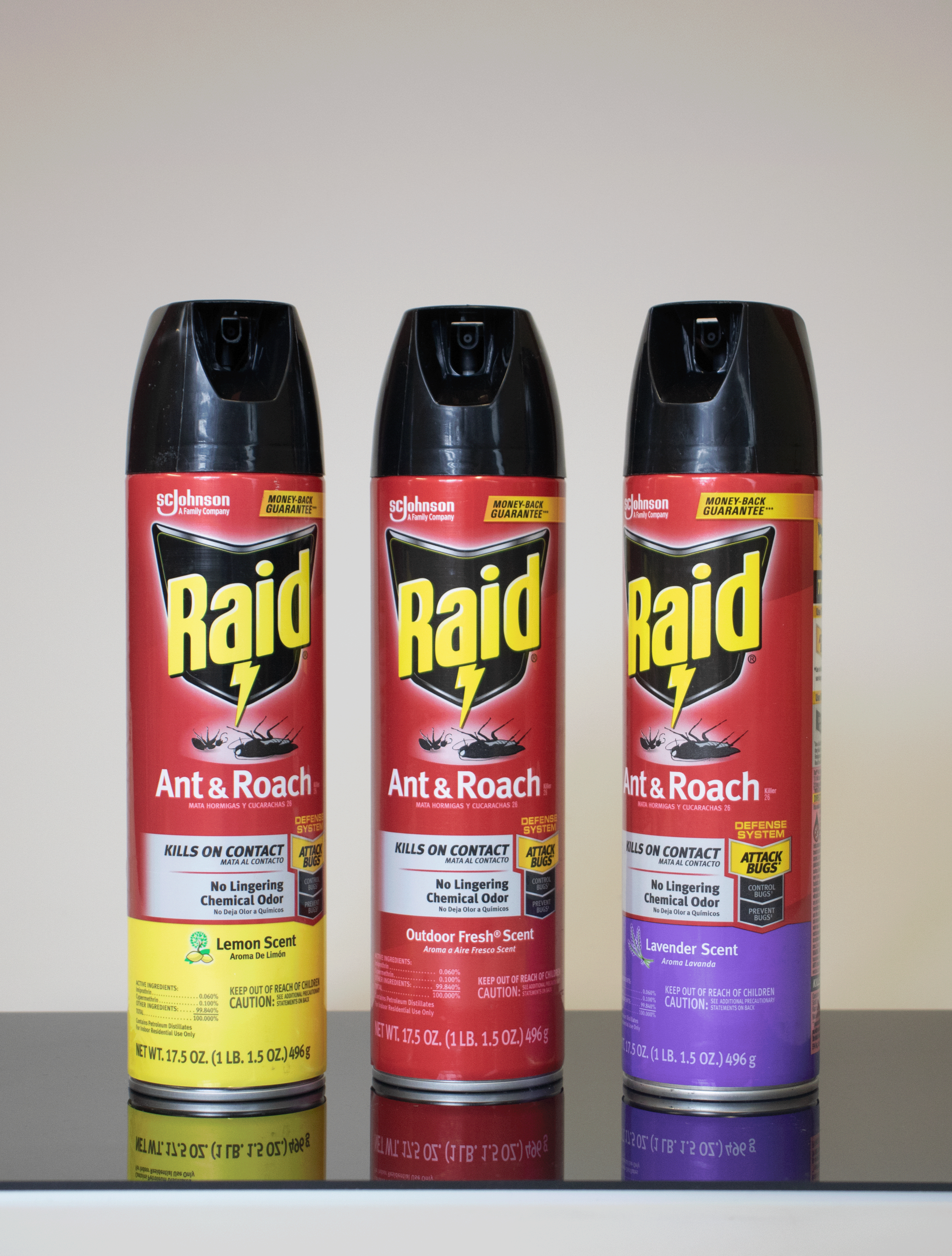
But RAID’s current packaging is outdated, and doesn’t keep up with the sleek, minimalist design of competitor’s products. It reminds viewers that they’re killing something, rather than giving them the comfort of a calm, reliable product.
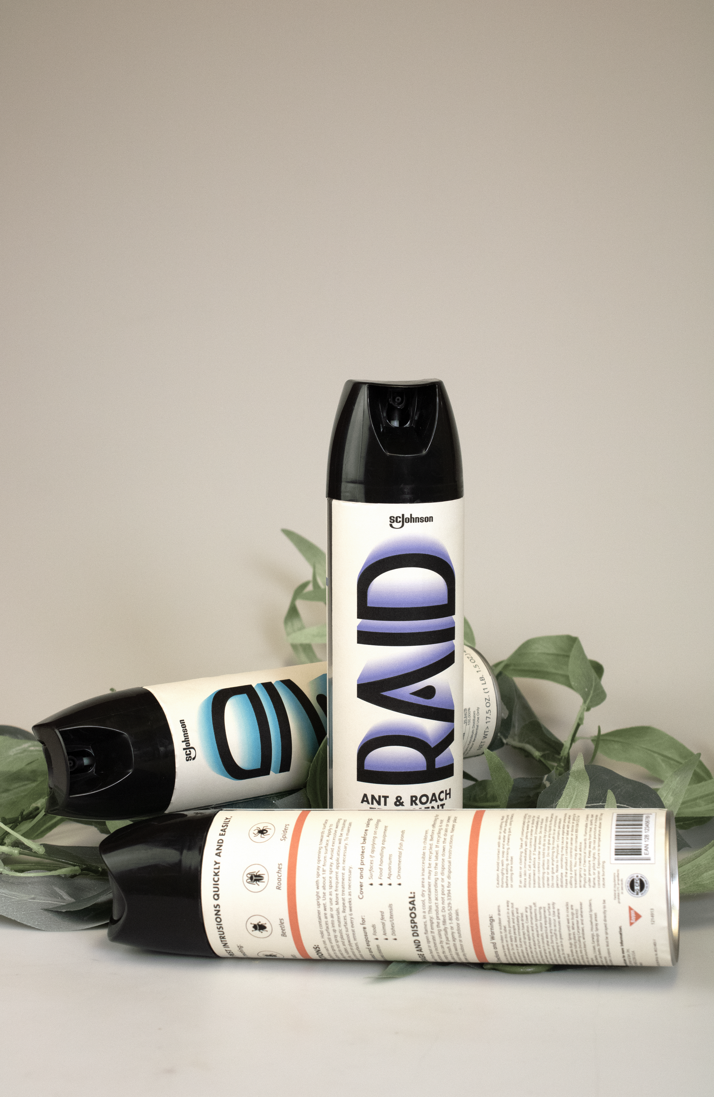
Well, thank god they have me.
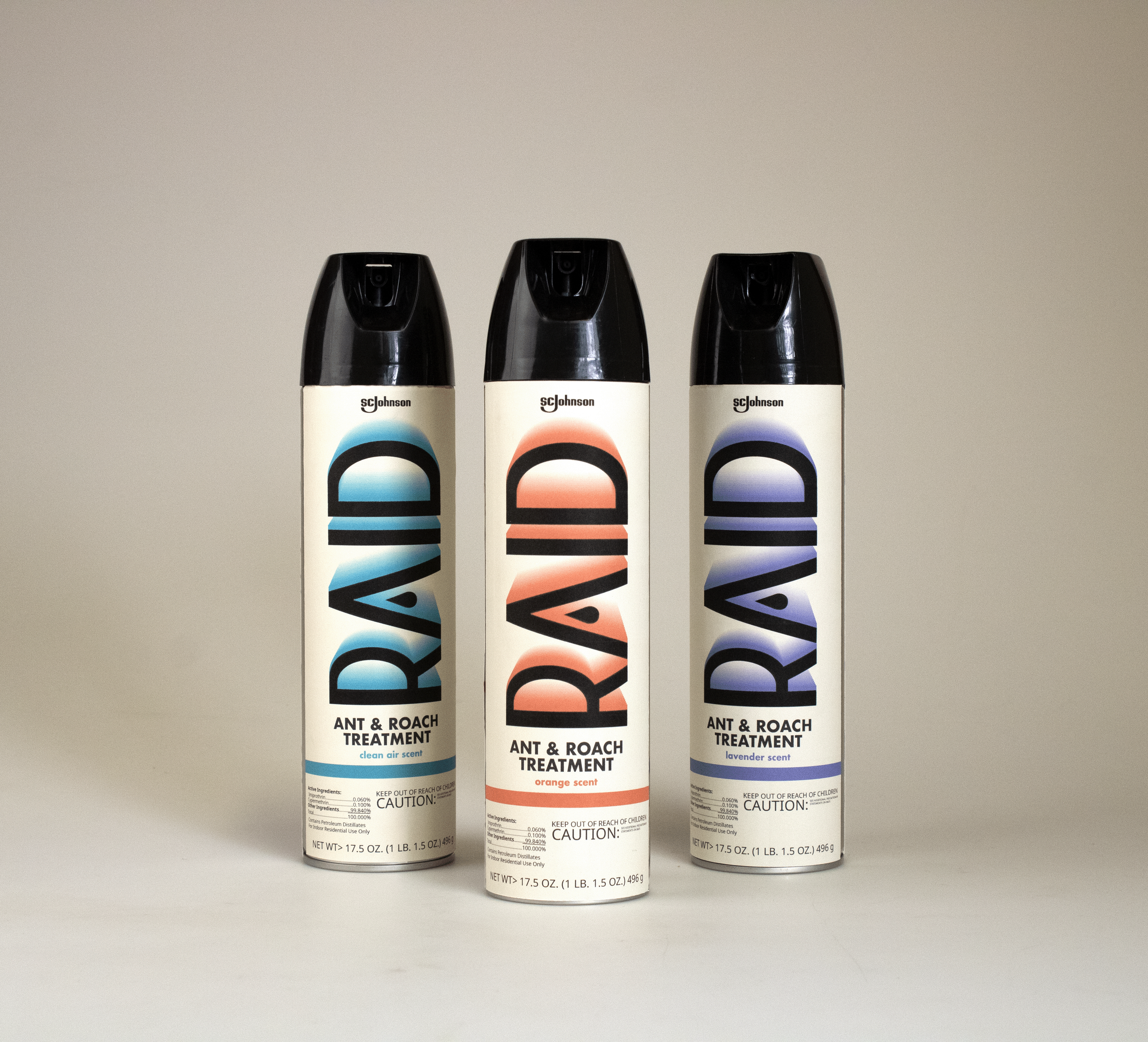
This brand redesign brings RAID into the luxury cleaning products space, and reminds viewers to stay calm when engaging with this product - and to not be afraid to reach for it despite the health warnings.
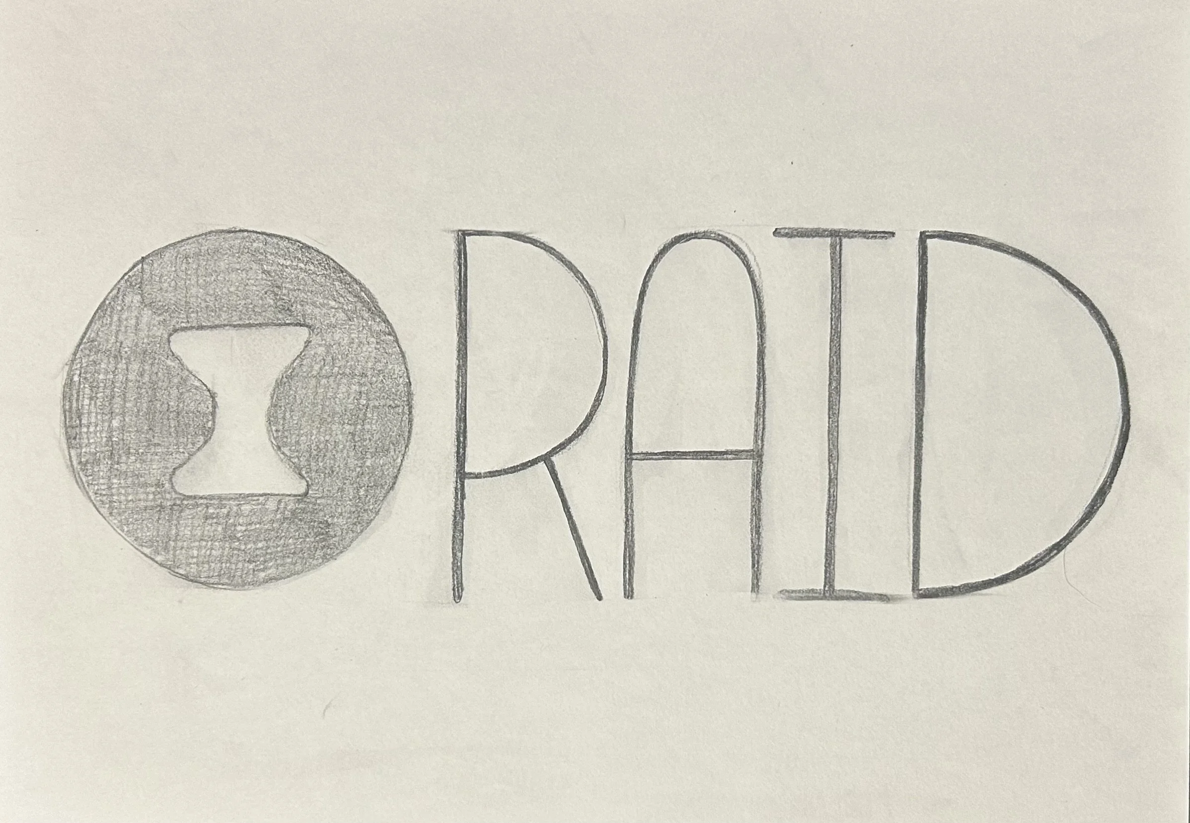
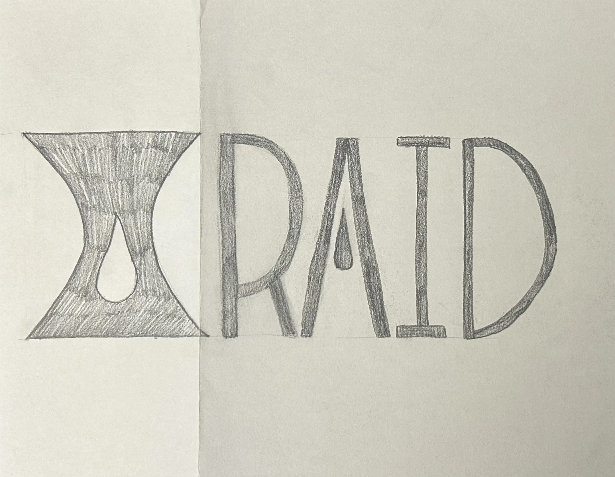
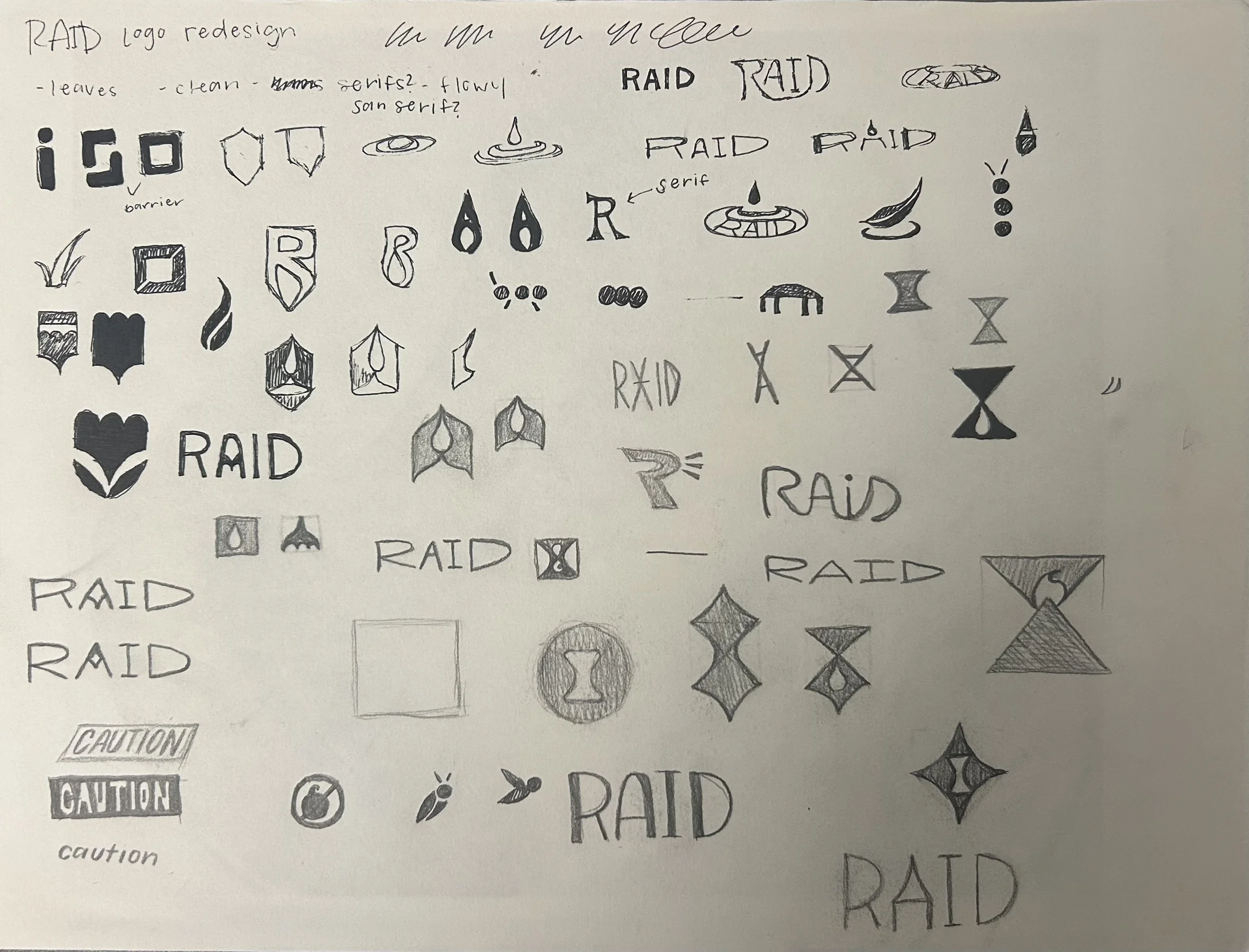
This project went through several iterations, including physical application, before settling on a final design.